What is information design (these days)?
Well, what isn’t it?
It’s the nutrition label on your food. The recipe in your cookbooks. The instructions for your Instant Pot.
It’s the directory in your office. The vacation schedule on the wall. The pie chart in your presentation.
It’s the flight options on a travel site. It’s the wayfinding in the airport. The road signs you drive by.
It’s a web page. A wiring diagram. A weather map. A patent drawing. A magazine spread. A software toolbar. A table of contents.
It’s your résumé, your exercise app’s stats, your phone bill, your car’s dashboard.
It’s the infographics and other communication tools we create.
Information design is so much more than you might think because it’s…
“…the practice of presenting information in a way that fosters an efficient and effective understanding of the information.”
—Wikipedia
The term ‘information design’ sounds academic, but it’s really egalitarian. Its entire purpose is to explain something so people can take informed action. And like, say, air, it’s something everyone needs yet rarely thinks about until it’s desperately needed.
As a subset of graphic design, it’s less about persuasion and more about communication. But “efficient and effective” doesn’t exclusively mean simple, plain, or minimalist. What matters is clarity and engagement that leads to understanding through appropriate presentation—sometimes that means simple, sometimes that means robust.
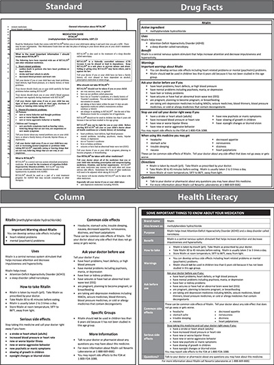
A 2014 Northwestern Medicine study showed that redesigning the instructions that accompany prescribed medications increased patient comprehension. “A version that followed health literacy best practices and grouped content in a simple, concise table was better than all others. Importantly, this version not only was able to improve patients’ demonstrated understanding of prescribed drugs, but it was of disproportionate benefit in aiding those with limited literacy skills.”
No one’s giving the winning piece (see bottom-right) a design award, but it doesn’t need one. Its success is value enough, and proof that thoughtful yet simple improvements in the design of information can lead to significant improvements in its comprehension.
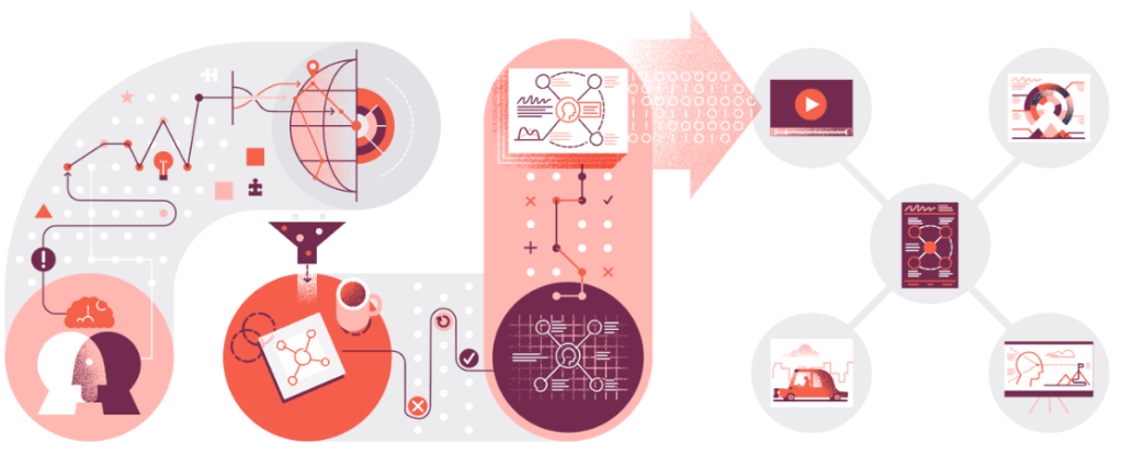
But even simple requires a multidisciplinary approach: visualization and writing paired up with teaching and usability. And simple isn’t always best—many of our infodesign projects end up highly illustrative or densely designed. These tools engage people not only because they’re visually rich, but because they bring all of those disciplines together to present the content in a way that really engages and educates… and even, when appropriate, entertains.
But depending on what you’re designing, the list of disciplines just gets longer:
- Good charts require an understanding of color theory and data visualization.
- Good infographics require illustration, typography, and graphic design skills.
- Good magazines, newspapers, and annual reports require expertise in publication design and editing.
- Good apps, web sites, and experiences require skill in UX, interface, and interaction design.
- Good animations require an understanding of physics, A/V, and technology.
And there’s plenty of overlap amongst all of these. Because when you ask what information design is, the answer is that it’s a little bit of everything—and these days it’s everywhere.
Illustration by Chris Roettger / Tremendousness.