IBM made Cognos Analytics 11.1.7 available for download in August 2020. This is a Long-Term Support (LTSR) release, as it is the final release of the 11.1.x version, which means it will be supported for the next 2-3 years.
The Cognos 11.1.7 release has very significant enhancements including the new Cognos Mobile App, API Connectivity, enhancements to report authoring, dashboards, data modules, data sets, scheduling, and sharing capabilities, performance enhancements, and more.
Here are the highlights of the new and changed features in the version:
Changes to Dashboards
A bunch of new and exciting enhancements and additions were made to dashboarding, including:
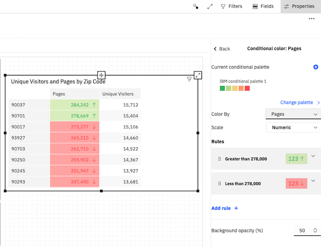
Conditionally format crosstabs
Dashboard authors can define rules or thresholds to color cells based on key business metrics. These rules can be created using static numeric values or based on a percentage against an existing field, i.e. a calculation or coming directly from a source.
Drop zones on visualizations
Authors can add drop zones to visualizations themselves to help them understand the types of visualizations they want to build using drag and drop gestures. They can start to type in the field name you like in the drop zone and Cognos Analytics 11.1.7 provides selections to choose from.
Export visualization data to a CSV file
From the data tray, authors can choose to export either summary or detail data.
Schematics
Dashboard authors can leverage schematics as custom visualizations. Schematics are tagged shapes/polygons in an SVG file, which can be a diagram representing a spatial relationship.
Create module filters
Module filters can be created as calculations would be from the metadata tree, which can be applied to individual visualizations or the full dashboard if inserted into the filter shelf and it can be reused wherever needed.
Create custom templates
Authors can now save their dashboard layout, visualizations, colors, logos, etc as a template to use as a starting point, which saves a lot of time.
Other new visualization capabilities –
- New title options – smart visualization titles are on by default
- Logarithmic axis scaling
- Custom axis ranges
- Custom label options in pie charts
- Bullet chart range coloring
Check out this video that shows a great summary of what’s new in Dashboarding.
Changes to Reporting
There have been several reporting enhancements, including:
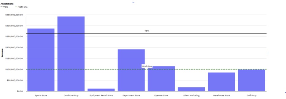
Adding a baseline to a visualization
You can add horizontal or vertical lines that cut through the chart to indicate major divisions in the data, for example, you can add a baseline to show a sales quota or break-even point.
Clustered combination and stacked combination visualizations
You can use a clustered combination visualization to compare values by one or more columns, such as sales for products per country and use lines to highlight relationships between multiple data series.
You can opt for a stacked combination visualization to compare the proportional contributions for each item to the total, such as sales for products and sales for products each month and use lines to highlight relationships between multiple data series.
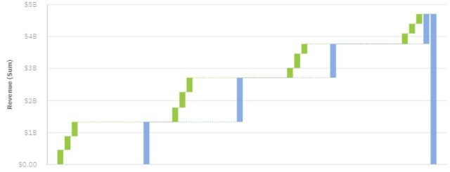
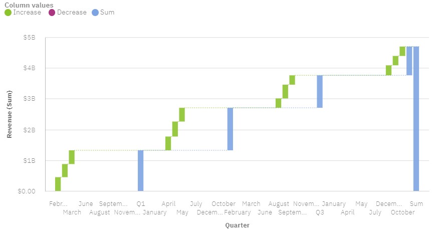
Sub-categories added to waterfall visualizations
You can use sub-categories in waterfall visualizations to display how categories are built up to display cumulative effect of a series of positive or negative values. Report authors can now use sub-categories in addition to display how values are aggregated at different levels. For example, you can see how the revenue of each month contributes to the quarterly totals.
Comparing measures in a visualization
The number of visualizations that you can use for comparing measures has increased.
You can compare measures from the same category in a visualization by adding multiple measures on the measure slot.
Comparing measures is only available for the following visualizations: Area, Boxplot, Hierarchical packed bubble, Packed bubble, Point, Scatter, Combination chart, Line, Pie, Radar, Tree map, Waterfall, Word Cloud.
Run Single Page Report
You can now run a single report page in different formats.
Changes to Data Modules
Cognos Analytics has worked over the course of time to update Data Modules to be more and more in line with Framework Manager. A couple of notable additions have been made in Cognos Analytics 11.1.7 for Data Modules.
Check out this IBM blog that shows the difference between Data Modules and Framework Manager.
Sample retail calendar
When creating data modules for relative date analysis, you can now use the sample retail calendar based on the National Retail Federation (NRF) 4-5-4 Calendar.
Additional out-of-the-box filters in sample calendars
Additional, predefined date filters were added to all sample calendar data modules.
The following new filters are available for relative date analysis:
- Current week
- Prior week
- WTD (week to date)
- Prior WTD
- Same week last year
Changes to User Experience
Carbon Design changes
Carbon is IBM’s open source design system. Additional Carbon Design practices were implemented, such as new icons and updates to fonts and colors. The adoption of Carbon Design provides a consistent user experience across IBM products. Read more about Carbon here.
Mobile
Cognos Analytics for Mobile is new in release 11.1.7. Cognos Analytics for Mobile allows you to view dashboards, stories, and explorations on your iOS device. You can quickly see how your business or organization is performing at a bird’s eye view, or dive into the details. Monitor important KPIs across the enterprise, share your findings with your colleagues, and set alerts to stay on top of changes.
NOTE – Cognos Analytics for Mobile is only available for Cognos Analytics on Cloud On-Demand and Cognos Analytics on Cloud Hosted in release version 11.1.7.
IBM has added a ton of new capabilities to this latest release of Cognos Analytics 11.1.7. You can see the full list of new and changed functionalities in our press release. The improved user experience helps make this already great BI solution even better. As this is a long-term release, we highly recommend upgrading as soon as possible. Please contact us today to schedule your upgrade to the latest and greatest version!

Recent Comments